The Smead Program
Established in 2017, the Smead Program is named after Joe and Ann Smead, long term supporters of the aerospace engineering sciences program at CU. The program was created to help support the department by funding graduate students and investing in their future and success. The Smead Program has crafted an inspiring environment that brings together outstanding graduate students, faculty, and visiting professors and fosters opportunities to explore interests, gain understanding. and contribute to the solutions of important research questions.
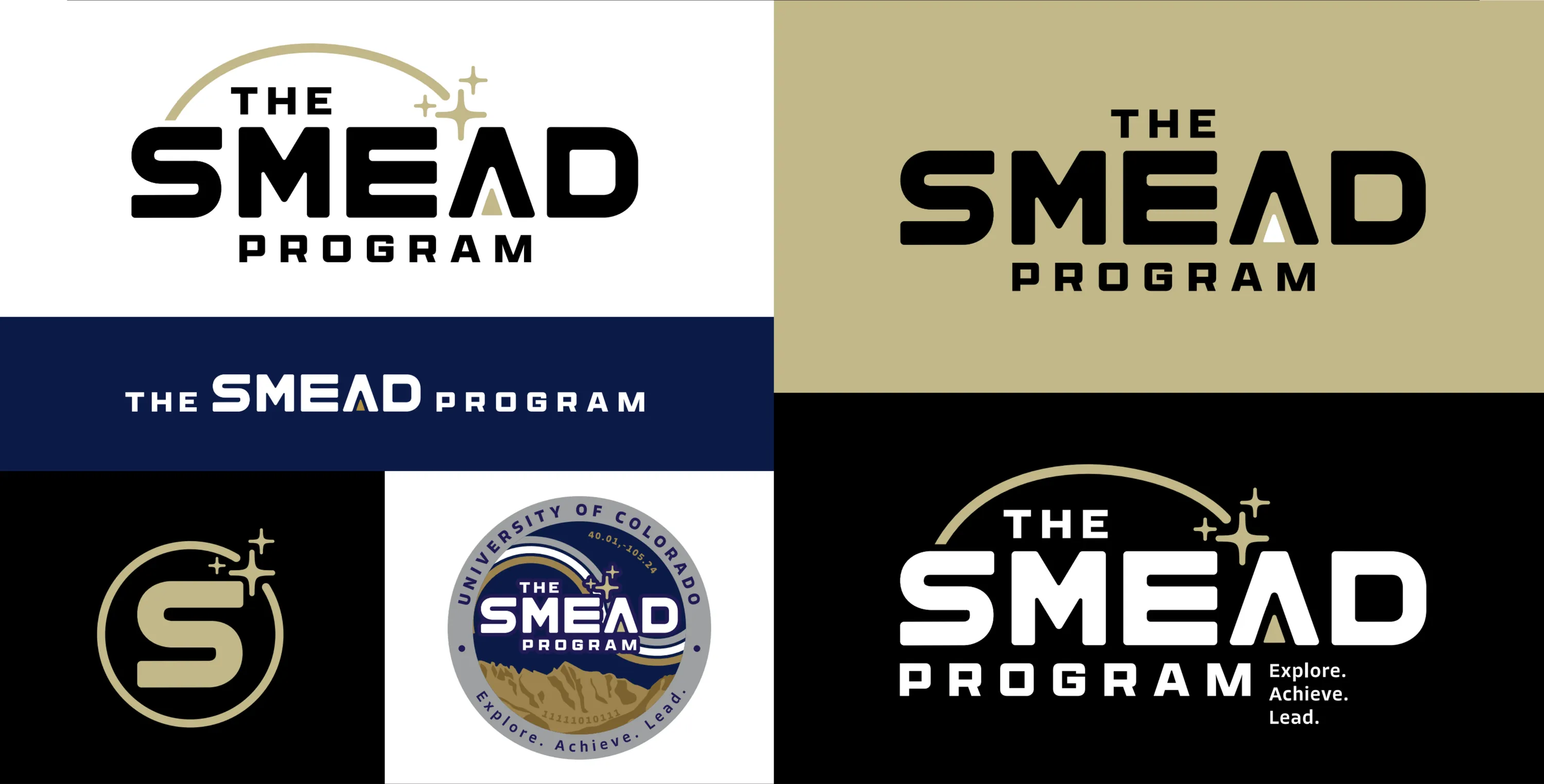
What we delivered
The Smead Program logo is designed to be both impactful and prestigious, embodying the program’s history and core values. Key elements of the logo include:
- Three Stars: These symbolize the program’s founders and evoke a sense of academic excellence.
- The Arch: Representing movement, community, and collaboration, the arch is a visual cue for the program’s fundamental principles.
- Arrow in the “A”: The upward-pointing arrow within the “A” in “Smead” conveys inspiration and dynamism, reflecting the forward-thinking nature of the program.
This thoughtful design ensures the logo not only looks distinguished but also tells the story of the Smead Program’s heritage and aspirations.