Creating a color story in merch collections
- Home
- Branding
- Merchandise design
- Creating a color story in merch collections

Color visually communicates a brand’s values and personality.
Color can create an emotional connection between a brand and its target audience.
A color story is a collection of colors that complement each other.
When used correctly, a color story can look aesthetically pleasing while simultaneously evoking a brand’s unique qualities and differentiators.
Key Takeaways
Why use a color scheme in merch collections
A consistent color palette throughout an entire merch collection guarantees a few things:
- Instant outfit: All items in the collection will be wearable together.
- Shelf appeal: Apparel will look cohesive at the storefront.
- Consistent online presence: The color story created in the apparel will translate into aesthetically pleasing promotional imagery (hello, beautiful Instagram grid!)
- Fosters deep connections: By thoughtfully picking a color story, you’ll evoke the right emotions with your customers that reflect the brand’s values/ethos.
It’s ok to stray from your color scheme a little bit — that can add some excitement! Just make sure the colors you’re introducing compliment your existing color story and align with your brand’s vibes.
Finding your brand’s color story
Color is a powerful tool that can be used to provoke feelings.
By understanding the meaning behind colors, you can utilize a palette that reflects your brand’s unique qualities and ethos.
Common color palettes found in apparel collections
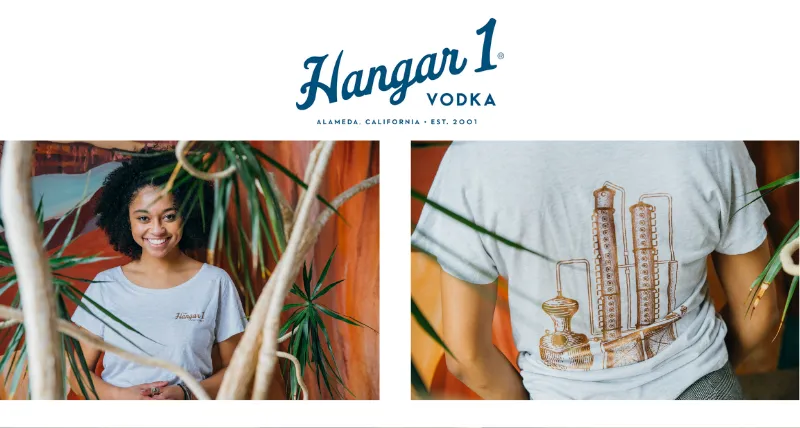
Neutral and muted tones
Effortlessly chic, understated, and reliable — these tones are guaranteed to look good and are always wearable.
Think creams, heathered greys, and muted down tones (mauves or sage, anyone?)
Versatility and low-key confidence is your mantra.
Example: Hangar 1 Vodka custom apparel collection

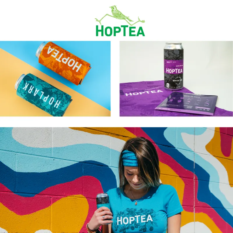
Bright and vibrant
Energizing, optimistic, and courageous.
Your brand isn’t afraid of color, in fact it embraces it!
You’re all about self expression. While loud at times, your audience loves the playful and vibrant colors of your brand and proudly wears it.
Example: HopTea

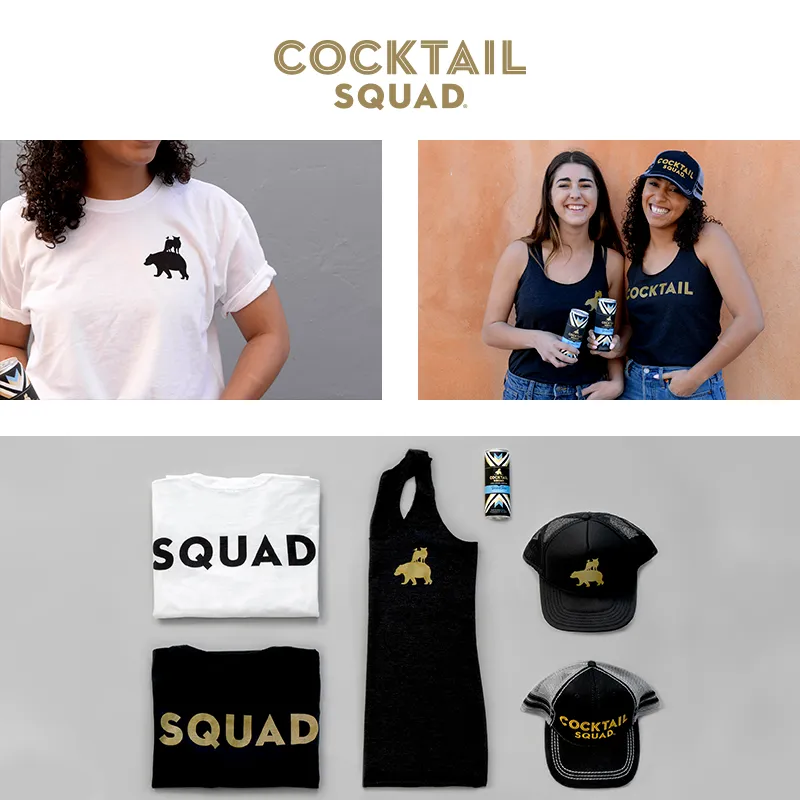
Modern and bold
Timeless, edgy, and minimal.
A simplistic palette of black, white, and greys grants an opportunity for bold contrast or an unexpected splash of color.
Maintaining a cool and minimal presence is key within this aesthetic.
Example: Cocktail Squad

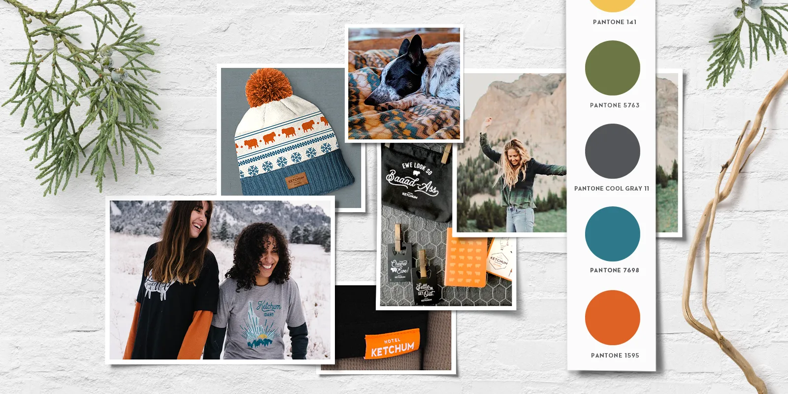
Earth tones
Organic, warm, and approachable.
This palette is designed specifically for the adventurous at heart and outdoorsy folk.
Earth tones pertain to all colors found in nature, from rich mineral tones to deep forest shades.
Let the great outdoors be your inspiration!
Example: Founder Brewing Company

Incorporating your brand colors
Pick a color story that compliments your brand colors and enforces your ethos.

The best method to highlight your brand colors is through decoration. This guarantees a near perfect pantone match.
Examples of decoration methods that can showcase brand color:
- Screen print
- Embroidery
- Patches
- Woven clamp tags
We can incorporate your brand color as the item color as well.

Keep an open mind as that can be tricky. Luckily our team is up to the challenge and has the knowledge to make the perfect product!
Utilizing your color story
Once your color story is sound, it’s time to incorporate it in a tangible and tactile design approach using different apparel items and promotional products.
Think t‑shirts, hats, water bottles, duffels, Bluetooth speakers — all these items (and more) can be thoughtfully selected and designed with your brand’s color story in mind.
Our team of branding experts can find products that fit within your desired palette and that work with your brand, industry, and target audience.
